Thursday, 29 March 2012

Final Result - Magazine


Our magazine front cover to market our film Lost Soul was based on the March 2001 edition of the Empire magazine which centered around the Hannibal film. Our main reason why we liked this cover was because of the striking pose on the front. With only half the face seen, it appeared very creepy and unknowing as we couldn't see the whole picture. We did a similar thing in our trailer, in which an over the shoulder shot only revealed part of our antagonist. By doing this on our front cover, it gave a continuous feel to it and the audience may be able to link the two together. Charlotte took a similar image and then imported it into Adobe Photoshop and went from there.
We chose the magazine Empire because it is a popular magazine with a large readership. However, the films which Empire usually advertise and market are sci-fi, fantasy, superhero or action. By using this magazine to advertise a horror film to a mainstream audience made it more different than normal. We did play it safe, though, by adding in a popular director of superhero film's Chris Nolan at the bottom in a special fetures section. 
As opposed to our film poster, in which our main focus was the location, we made our primary focus the ghost on our magazine front cover.

Wednesday, 28 March 2012

Magazine Cover Analysis - Hannibal (Research & Planning)

One way to draw in people's attention is through the use of a very dark colour scheme. This is done with the March 2001 Empire edition. It has an image covering half of the page, and then a black background with simplistic text on the other. Because you cannot see all the image, it gives a suspenseful feel to the image, which makes it very effective.
The colour scheme is fitting with the character's eye, which, once again, interlinks all of it without any text or colours overpowering the image. The large scale image and text help the reader see that these two are linked and automatically think about how they fit together and in what context.
The cover is effective because it is not advertising mainstream movies like superhero ones and focuses on unconventional psychos instead of love stories, for example.
Text size is also a relevant factor because it shows the main focus of the magazine. Other features and actors in the magazine are listed to the bottom right in smaller font size, which makes it less important and is not the first thing a reader is drawn into, which doesn't take away the effectiveness of the central image.
Words like 'exclusive' are also good ways to draw attention to the cover because it makes the reader feel like they are going to know the information first. However, the cover must be careful not to be too revealing so it ruins the film for moviegoers.

Magazine Cover Analysis - Scream (Research & Planning)

Despite the popularity of horror, it is not the type of film that is heavily promoted in to the masses in a populat magazine like Empire. There are a few covers, all representing and promoting horror in a different way.

The first cover is of the cast of Scream 2. There is no ghostface on the cover, simply the main female characters posing together. They are in the centre of the cover together, surrounded by other movie titles and influential actors, but it is obvious that the main focus of the issue is horror films. This is evident because of 'Horror Special' written at the bottom of the cover in red writing; the colour red being associated with blood and danger. The text is simple and bold, with no evident font style to link it to a genre, so this block text is simply standing out and attracting people's attention to read. With both the picture and writing inviting people to read, it immediately shows that they are the main feature of the magazine.


Because of the popularity of horror, they have tied in this issue promoting Scream to feature a '50 Scariest Movies' feature, which could be something we use when creating our front cover, because it makes it more relevent. The continuing theme will be more professional instead of mixing horror with science fiction, for example.


Throughout the cover, the same colours are used: white, red and black. This makes it look very professional and all interlinked. The yellow background of the '50 Scariest Movies' is striking and grabs the readers attention, this is a continual idea of all features used within an Empire issue.
Overall, this cover focuses on the actresses in the film rather than the characters within the film. I feel we will use an image or character from our film on our front cover because we are promoting the film and not the genre.

Magazine Cover Analysis - The Shining (Research & Planning)

A way to promote our film on a magazine cover could be by linking it to previously released horror films. By doing this, the readers will be attracted into the magazine by noticing the name of an influential horror film. For example, our front cover could include The Texas Chainsaw Massacre, one of the highest grossing horror films ever. This way, our film will be noticed because of another films iconic status.

The use of an iconic actor will also draw attention to the magazine cover, as seen with Empire's cover revolving around The Shining. The use of the recognisable image means that people will be interested because they know about it. The same applies to a memorable quote.
The text styling on this cover is very retro and goes back to the beginning of cinema. However, our cover will just focus on our film so we will use more modern text and relate it to the horror genre not just cinema in general. Our text could be less rigid and resemble dripping blood because these are generic conventions of a horror film and we have used this styling of text in our trailer and poster.
Despite the collectors issue, there is still a bar code, pricing and issue number on the front, as there is with every other cover; making this a vital part of what we need to include in our own cover design.
The colouring throughout the cover is kept the same (Pink and Black) which makes it look professional, so we too will try to keep colours minimalistic to increase its professionalism.

Wednesday, 21 March 2012

Editing (21st March)

Following our audience feedback session last week, we did some more editing to make our teaser trailer better using the constructive criticism we recieved.
Our main issue with the trailer was the length, as when we showed it to the class it was about 2.10 minutes. It was longer than we planned because we were worried that we would not have enough footage, but watching it back on the big screen we realised that some of the shots were very repetative and too long. Today, Hannah took out two of the panning shots and refined the other shots which were on the screen for too long with nothing happening, which took away the effectiveness of the montage. After cutting these shots down, we took the time down to around 1:40. Another way we took the time down, was deleting one of the film distribution indents, which took off another 20 seconds.
Another piece of constructive criticism was to include a more diverse range of shots. We feel that we could add in some high and low angle shots and, if we can, we could film them over the weekend (24th and 25th March) but only if we are all avaliable.

Tuesday, 20 March 2012

Editing and Revised Lost Soul Teaser trailer

Following our auidence feedback, we did some more editing to our teaser trailer to cut it down to less that two minutes. We ended up cutting the shots that we realised were too long and repetitive. Today, Hannah took out two of the panning shots and refined the other shots which were on the screen for too long with nothing happening, which took away the effectiveness of the montage. After cutting these shots down, we took the time down to around 1:40. Another way we took the time down, was deleting one of the film distribution indents, which took off another 20 seconds.

This is the second draft of our teaser trailer for our A2 Advanced Portfolio. We feel  that it is an improvement compared to our last due to being refined and using constructive criticism we recieved following our auidence feedback.

Magazine Analysis

The front of Empire magazine is mostly of the main character from the particular film. In this case it's Captain Jack Sparrow as it's advertising Pirates of the Caribbean. This makes it the main focus of the magazine. This immediatly draws you in not only because you know who the character is, but the fact the image is taking up most of the front cover. All of the magazine front covers that i have looked at have one main image of the main character that has a significant role. We will use this idea for our magazine.

The text on this magazine stands out because of the use of colours. Using yellow contrasts with the background and really stands out and is easy to read from a distance. 
When we design and work out what extra things we are going to have on the front of our magazine, we will use a colour font that will stand out from what ever background image we use. Although because our moive genre is horror, we will probably keep the background a plain colour, it would either be black or white. This is because for a horror we want to use a limited amount of colour so the text will wither be red, black or white- depending on the background. It also has information of what will also be featured inside the magazine but not too much information has been given so you buy the magazine to know what the full story is about.
At the top of this magazine cover it say's 'movies' biggest year ever!'. The use of colour is what makes this stand out. The 'biggest yesr' in yellow which is a bold colour really catches your eye. What i have learnt from analysing this magazine front cover is the use of the image and how the font and colours used on the font makes the magazine come acorss.  The main points that I we will be using in our magazine are;
  • one image - main character (face or body shot)
  • minimum of three font colours
  • circle offer
  • what wil be included in the magazine (not too much info)
  • possible background ( probably not as it's horror)

Audience Feedback

Monday, 19 March 2012

Poster Analysis - The Cabin in The Woods ( Research and Planning)


The genre for this poster is horror. You can tell this by looking at the colours, images and text that they have used. A lot of horror film posters have one main image on them that they want you to focus on. These images are usually 'scary' and are the main focus point of the film. This film is titled, The Cabin in The Woods and has an image of a cabin in the foreground and a faded image of a woods in the background. This doesn't give the storyline away. It's straight to the point. They want you to focus on the cabin and this poster makes that happen.

This poster has a limited amount of colour. The colours being brown, grey, black and white. This is another horror poster convention. Using these dark and plain colours adds fear to the poster. As if colours were used, it would give it a happier feel. Whereas dark colours makes you feel sad. These colours give it an empty feel.

Horror posters commonly have one image on with the title and a tag line. This keeps it simple and makes you focus on one thing. It makes you guess whats going to happen in the movie. The tagline says 'You think you know the story'
This is an eye catching tagline because you're questioning the story. This draws you in to want to see the movie as you want to know what is meant by it. It's short, simple and straight to the point. From looking at this poster i feel that when it comes to designing our groups poster, we are going to use just one image that will be the focus point of our film. I feel that we should include a tagline as it brings more attention to what the film will be about and draws you in, and is a typical convetion used on horror posters. The reason this poster is so effective is because it has stuck to the typical conventions of a horror film poster.

Thursday, 15 March 2012

Evaluation Activity 3

What have you learned from your audience feedback?


We showed our trailer to our media class who then gave us feedback, both positive and constructive criticism. We recieved a variety of comments which helped us change the trailer and what worked.


A strength of the trailer is the music, which was called very stereotypical because of it's creeypy sound. The simple, repetative piano sound gives a chilling feel to back up the montage, whilst not distracting from the images on screen. The high pitch of the music is repetitive of a horror film because it is often very unsettling. The repetetive also adds suspense to the audience because they feel something scary could happen any moment, but it doesnt, which challeges the audiences expectations. 
Another strength noted was the location. We chose to film at the grounds of Polesden Lacey because there were a lot of different areas within the grounds which added diversity to the film. The over-the-shoulder shot of the ghost uses these locations to her advantage as this gives her the upperhand compared to the friends.
The shot of the bathtub with the hands coming out was also seen as a very effective shot which was reminiscent of a horror film. The group felt this gave the audience the creeps because they didn't see the whole person, which makes people ask questions which, in terms of marketing, people will see the film to get answers.

However, constructive criticism focused on the length of the trailer. When we first uploaded it to show to the class, it was about 2 and a half minutes yet we were aiming to produce a teaser trailer, which we analysed and found that the length of a teaser trailer ranged from 1.30 minutes to 1.40 minutes. Following the feedback, we cut out some repetitive shots and refined some footage so it began and stopped quicker and didn't waste time. The feedback allowed us to change this to make more identifiable as a teaser trailer.
Another was to add in more variety of camera angles, such as high and low. However, we were unable to find anytime to refilm and add some more shots in. If we were to redo this advanced portfolio, adding a more diverse range of shots would be sometime we would improve on.

Evaluation Activity 4

How did you use new media technologies in the contrustion and research, planning and evaluation stages?

On the computer we used a variety of programmes to help complete our advanced portfolio. These programmes were used in research and planning, filming and editing as well as the evaluation. 

To film our teaser trailer, we used a digital HD DVI video camera made by GE. This camera allowed us to pick up a lot of detail in our shot and give us a very clear image, which made our final piece look very professional. Comparing this with our Year 12 foundation portfolio, it looks much better because the picture quality allows for more clarity and when we added effects in and changed the contrast of the picture, it was still clear and not pixelated. 
To give the shots more professionalism, we used a tripod to steady the shots. We used this for each shot as it kept it steady because we are not using the hand-held camera effect. It allowed the pan to be steady and flow more so it wasn't jumpy and with the tilt and high angle shot it didn't shake, which will not put the audience off of what is actually in the frame. Using the tripod was a progression from last year because, although we were trying for the hand-held effect for the audience to feel they were in the stalkers position, there were some shots which looked very amateur without a tripod; so this year watching it felt like much improvement had been made.
The high definition camera allowed our shots to be much clearer.
 
Using the tripod allowed our shots to look more professional and
 allowed us to experiment with different camera shots and angles.
There were a vast amount of other media technologies which we used in our research and planning stages and creation of our film poster and magazine front cover. To edit our film we used Adobe Premiere Elements (4). We learnt more about the porgramme this year because we experimented more with effects and transitions. For example, last year we simpl inserted a black screen, which, although effective, looked a bit jumpy. So this year we used a fade-to-black effect which broke the trailer up and kept suspence for the viewer becuase they didnt know what was happening next.
We had to learn to use Adobe Illustrator (3) and Adobe Photoshop (2) from scratch. By doing this, we were able to develop our skills in making the image look professional because we experimented with layers and colours. We used internet search engine Google (9) to search for images to edit into photoshop. For instance, we searched for the logo of popular Empire magazine and then cleared the background to place onto our own cover. The Empire magazine website (7) also helped us create our magazine front cover. This website helped us by allowing us to go through the arcive of previous front covers, which helped us create as close to a real magazine front cover as possible by taking not of what covers included, such as bar codes, prices, issue numbers and types of images etc.
In the first research and planning stage, we had to gather statistics which would help us decide on the genre. Film institiutions are concerned with revenue and so are interested in the audience they could be targeting the film at. For a horror, we found that males, aged between 16 and 24 which made us look into the conventions of the horrors. We used YouTube (1) to look into horror teaser trailers and analysed them to see what was repeated within the genre.
Throughout, we have used Blogger (5), an online blogging site, as a diary to note down all our research, plans and to keep track of our progress with filming and editing etc. By doing this, we stayed on top of our projects by keeping up to date and alos keep a checklist of what we needed to do. To help Blogger look neat and organised, we used Paint (8) to organise photos and images in order to make the images easily viewed.

The vast aray of media technologies we used in the various stages whilst creating our Advanced Portfolio.

 
During the creation of our magazine front cover and the edting of our footage for our teaser trailer,  we learnt a lot more about the program and our abilities became much stronger.


Evaluation Activity 2

How effective is the combination of your main prduct and ancillary texts?

'The three ancillary texts we produced for our advanced portfolio for our A2 media studies course was a teaser trailer, a magazine front cover and a film poster. These three media help to advertise and market a film which is due to be released.
The teaser trailer is one of the first things to be released, so is therefore relativley short and vaugue. It does, however, leave questions that the audience will want answered. For example, with the hands coming out and retracting in the bath leaves the audeince wondering who she is. This links nicely to the magazine front cover, on which the ghost is the main image, so the audience may believe the article will contain some sort of spoiler or clues as to who she is. The viewers will also be able to relate the two because the film's title 'Lost Soul' is on the cover as well as in the trailer.
In each of the media texts, we focused on a different part of the film. The trailer focused on the grounds of Alcott Manor as this is where the horror of the film happens and is the most visual, giving the audience the chance to put themselves in the position of the group of friends. The poster focuses on the fictional Alcott Manor. By doing this, it is a generic convention of horror films because of the haunted house. The simple picture with the darkened background doesn't give many details away, which will keep the audience guessing. The tagline also makes the audience interested because it directly addresses them by saying 'Watch Your Back'. The Empire magazine cover focuses on the antagonist in the film. The dark colour scheme helps convey the disturbing horror genre. Together, each of these convey the generic conventions of a horror film.
An improvement on all three could be having an image which is repeated on each media text, which would help the audience associate all three. Such as the bloody hand print on the poster, if we had put this in the trailer and on the magazine front cover in one way or another, it would have been a continuing theme to directly link the three together.'

Evaluation Activity 1

In what ways does your media product use, develop or challenge forms and conventions of real media products? (i.e. of teaser trailers/poster/magazines)

Tilt Shot of the fictional Alcott Manor

The introduction of the haunted house in the Woman in Black trailer.


This is one of the early shots in our teaser trailer.
It is introduced by a low to high angle shot. This is typical of a horror trailer because it sets the scene for the audience. The audience will be able to recognise this is a horror film because of its location, a grand, and seemingly unoccupied house, which is constantly repeated convention in horror films. By using this location, it encourages audiences to watch the trailer because it is repeating enough of the genre for the audience to be familiar with, but the story could offer some difference for viewers. The low to high angle tilt gives the fictional 'Alcott Manor' an empowering feel because the audience is forced to look up at it. This helps set the genre of the film because the style of the house is often this way in stereotypical horrors, for example, the size of the house, the turrets and grand entrance. This is a similar style to the Woman in Black (2012) because of how it introduces the house with a panning shot, but we decided to use a tilt. It is edited to be playing whilst there is a voiceover from a character. This is adhering to horror genre as this is evident in many trailers. It allows the audience to put two and two together; hear the story whilst seeing where it will take place. Other trailers which use a voiceover is Babycall (2012) and Cabin in the Woods (2012) and once again Woman In Black (2012).
This shot shows the characters discovering the grave of
'Elizabeth Wilman'; could this be the ghost?

The second screen shot is the introduction of the main antagonist character in the film, although not in full. The camera shot is a simple mid shot, this is because it can show enough to focus on without there being too much to take in and distorting the audience's concentration. For example, the simple location of the sparse woods means that audiences are focused on the characters and the suspicious looking gravestone. This shot in the trailer sets the story up when the characters are intrigued by who the grave stone belongs to. Digetic dialogue says it is the grave of 'Elizabeth Wilman', and following the voiceover from the early shots, audiences can link the two and begin to wonder if the dead girl in the bathtub is Elizabeth Wilman. The narrative can be associated with in this shot, because of repetitive horror films, the audience know that the group of friends will have to try to escape the grounds and kill the ghost. This shot is edited in after one of the friends dares the others to stay at 'Alcott Manor', which allows the audience to see that the friends have accepted the challenge without wasting time in the trailer showing them say yes.

The third screen shot is an inter title which is shown around 55 seconds into the trailer. By this time, the story and characters have been vaguely told or seen. The use of the inter title, is to fill in the blanks for the audience as well as introduce an element of uncertainty for the characters. For the audience, they feel the need for the characters to feel safe and survive, or at least see one escape (Maslow's Hierarchy of Needs theory), although the nature of the film may forbid this, challenging the audiences expectations. This shot is edited in using the fade-in effect on Adobe, this added suspense to the audience as it took time to appear on screen so the audience were not sure as to what was coming. This style of tag line 'No Soul Is Safe' almost implies a difference to horror films because it is showing that no character will have preference to another and that everyone is a target. This is different to the first three Scream films, when virgins were safe and wouldn't be killed by ghostface.


One character is taken by surprise; challenging the
audience's need to survive (Maslow's Hierarchy of Needs)
The fourth screen shot shows one character being grabbed the ghost. This shot is a mid to close shot which allows the characters emotion to be seen but it also adds mystery to why was she taken and not the others. The genre is suggested in this shot by the typical lone girl who is then targeted because of her vulnerability. The setting also helps suggest this as, through the montage, the location has been shown as a continuing, vast area of land which the girls are unfamiliar with; which further adds to them being easy targets. The target audience for a horror film is 16-24 males; a young girl getting captured could help prove Laura Malvey's Male Gaze theory. This shot continues on from a sequence of the same girl running from something with the audience hoping that once she hides she'll be safe - but then she is caught; which adds to tension and unsuspecting narrative of the trailer.

Two protagonists run away from an unseen threat -
What is it?
Where will they go?
This keeps the audience interested and
want to watch the film to find out.
The next shot shows two of the characters running from something or someone. Although the characters have not been fully introduced, you can tell they are scared. The audience will empathise with them as they will most likely feel the same if they were placed in a similar situation. Viewers could watch this film as a form of  escapism and therefore need to be reassured that one of the characters will survive. This will help the film generate revenue because the audience will want to see which characters survive - if any do. Narrative is clearly shown through this shot, as the characters are running from something and they are clearly just trying to survive. The body language of the characters highlights this, as they are continually looking over their shoulder and seeing if they are being pursued.

The first full body introduction of the ghost.
The introduction of the ghost is placed in the middle of the montage, and a quick flash makes it hard to determine although the audience, having seen the characters several times, will know that she is not one of them. The high angle shot highlights the fact that she is in control and that the friends are obviously not. The setting is also a new one, which demonstrates that the ghost knows her way around the grounds, once again handicapping the group of friends as they could end up lost, another threat to their safety. We used a special effect on Adobe, which darkens the image and grained it in black and white. This also helps show that the ghost is not of their age and the difference in shot could mean that she is not to be trusted.

The over the shoulder shot gives the
ghost the dominance in the frame.
The seventh screen shot is a high angle, over the shoulder shot of the ghost looking down on one of the friends, a possible target. This frame has several effects and conveys the genre of the film well. The high angle gives the ghost the power of the shot, reiterating older shots with the variety of surroundings, suggesting that the friends are the targets and weaker; with the ghost being more dominant. The over the shoulder shot almost gives the audience the chance to see from the ghost's perspective, which makes the audience uneasy because they want to see the story from the girl's side. This shot in the montage is quite long as the friend walks a while before noticing the ghost, which implies that they are less in control, which stops the audience feeling the need for the character to survive (Maslow's Hierarchy of Needs). The genre of horror is easily identifiable in this shot because you do not fully see the ghost, which makes the audience nerved and unsure about who or what the friends are being a threatened by.

The same two shots but with a difference; the hands can be seen but then disappear,
 this is repetitive of a horror film because it is creepy and suspenseful
The final two frames are from before the inter title of the film's name 'Lost Soul' and 'Coming Soon'. These two shots challenge each other and are very typical style of shots in a horror trailer. The first frame shows the arms of a someone slowly emerging from a bath outside, adhering to the earlier story told by the character of a woman dying in a bath tub which is now left outside. The slow movement is creepy and adds suspense to the audience. To them, this shot signals that the ghost is obviously free and haunting the friends. The second shot, when the hands retract back into the bath. This challenges the first shot because the audience think that the ghost is out, but in fact she has gone back into hiding, which once again throws the audience back into the unknown. Both shots are edited close together so that the audience do not forget the first. Those who are big fans of supernatural horror films could associate the bath as a way to kill the ghost due to the emphasis on the character emerging and disappearing the same way. The prop of the bath was actually on location and we used this to base our story around, as like most haunting in horror films, the ghost or spirit must start from somewhere or something, this narrative would be explored further in the actual film, but because it is a trailer the main plot is vague. These shots are repetitive of the horror genre because of the slow and suspenseful revealing of the hands and then they suddenly disappear, which echos Cabin in the Woods (2012).

Wednesday, 14 March 2012

Music

For our teaser trailer for our horror film we need to find suitable non-copyright music. We have a few specific ideas already and are using internet sites such as Incomptech to find the right music. We are hoping to have some quiet and slow harmony music at the beginning of the trailer, playing in the background, as the characters and story are vagueley introduced. During the montage section of our trailer, we want a piece of fast music with a beat to add it. As well as adding tension, this is a common part of teaser trailers for this genre because horror films are not focusing on characters or story and do not market around this.

Editing (14th March)


When we started editing today we began to remove the unwanted audio and digetic sounds from the footage because we will replace it with non-digetic music. When Hannah continued editing, her main focus was on the non-digetic sound. We want to have music playing mostly throughout the trailer. In our first free today we trialed the different non-copyright music that Charlotte and I found to see which one was most suitable; i.e what mood it set off and whether it fitted with the images. In the end we chose a very low note to play at the beginning of the trailer as the characters and story is being introduced. This way it does not overshadow what is being said. Throughout the rest of trailer we used the song Dark Awakening, which added a mysterious and supernatural feel to the trailer.
Another main focus today was to record and upload the voiceover spoken by Ana, the character who dares her three friends to stay the night at Alcott Manor. We recorded the dialogue during our third period media lesson and uploaded it shortly after. We then overlapped the voiceover onto the tilting shot of Polesden Lacey and the panning shot of the grounds, this shot gives an underlying message of isolation.
Also today, we all discussed and decided where we would add intertitles after watching the Babycall trailer in yesterdays media lesson. We felt this was rather effective and decided to add some into our own trailer. Hannah added the title of the film 'Lost Soul' towards the end and we also felt it would be more trailer-like. Another intertitle was added reading 'no soul is safe', which will play between the shot of the characters arriving to the grounds and panning shot of where they are. Another intertitle at the end reads 'Coming Soon', there is no specific date because it is only a teaser trailer.
We uploaded our teaser trailer after we felt we had edited it as much as we could with the footage and music we had. We will present it to our media class tomorrow but we feel we need to film more and add in a wider range of camera angles and shots.

Lost Soul - Teaser Trailer

Tuesday, 13 March 2012

Editing (13th March)

Today, two days before we show our finished trailer, we continued to edit our cut-down footage. The first thing we did was add the film distribution company indents of IM Global and Alliance, our chosen production companies, as well as a five second still of the trailers certificate to be played by the Motion Picture Association of America (MPAA). By doing this it adds authentication to the trailer as we have studied various teaser trailers to see that they have all been certified by the MPAA. We sped the two movie indents up to keep with the respected time frame of a teaser trailer. We removed sound from the production company indents because we will put music over the top, which is sometimes done in teaser trailers, such as the Woman in Black (2012).
We also looked through several websites of non-copyright music and found about six final songs which we will trial in our trailer. We brainstomed which section of the trailer some of the music will go in and tomorrow we will see which one suits the mood the best. Most likely we will cut some songs and use more than one to get the desired effect at the right moment in our trailer.
Songs on the shortlist are:
- Dark Awakening (to use at the beginning and a few seconds at the end)
- Doplerette (At the beginning)
- Gathering Darkness (At the beginning)
- Land of the Dead (During the montage)
- Measured Paces (During the Montage)
- Horror Spacial Winds (Unknown)
- Forever Sleeping (Unknown

Monday, 12 March 2012

Editing (12th March)

Today, three days before we show our trailers to our class for feedback, we began to edit more of our footage. On Adobe Premiere Elements we cut out more footage to reduce the overall time of our trailer, because we have opted for a teaser trailer, it must be between one or two minutes, otherwise it could be classed as a theatrical trailer. Today, we cut our footage down from around 5 minutes to about 1 minute 30 seconds.


Once we had cut the amount of footage down, we began to add some effects. One effect was the dip to black transition between a shot of the character played by Ana, who is explaining the situation, into the next tilting shot of the house at Polesden Lacey, called 'Alcott Manor' for our film. The computers we were using were running slow so we have yet to add other transitions and effects. We are planning to use quite a few fade in and black shots in our trailer, similar to the style seen in the Woman in Black (2012) teaser trailer.

We filmed our shots whilst it was light, because of the opening hours of the National Trust house, so we needed to darken the images to make it appear to be night time, a stereotypical convention of a horror film. To do this, on our selected shots we then changed the contrast. By doing this we selected the colour balance HLS x3 to create an dark enough picture that didn't distort the images or look to artificial.

Friday, 9 March 2012

Editing - Practice Titles (9th March)

We will not be having many inter titles in our teaser trailer because it is only a short trailer. We will include the title 'Lost Soul', 'Coming Soon' and possibly a billing block information titile, with basic production and direction notes. Information on another shot could be a website, a Facebook address and a Twitter hastag feature; all these are common in promting a film nowadays. There will be a lack of other intertitiles, such as a tag line becuase the film is not yet starting it's serious promotional trail, hypothetically.

Wednesday, 7 March 2012

Editing (7th March)

Today, we uploaded all our footage into Adobe Premiere Elements and began to cut each individual scene and deleting clips which were wrong, had mistakes and didn't look as good as other parts. By doing this, it makes it easier to edit the trailer together if we only have the decent footage to work with.

Revised Voice Over Script

To break our trailer up, we will edit a character's voiceover as another layer over shots of Alcott Manor (Polesden Lacey). By doing this, it shows our knowledge of using Adobe Premiere Elements and adds another filming style to our trailer.
We have tried several different ways of filming this, such as in a conversational tone, but we feel that it would be better simply as a descriptive voiceover, informing both the characters and the viewers.
The main things we need to include in this voiceover are the rumour, the location and what supposedly happened. We have taken inspiration from the thriller film The Woman in Black (2012), in which a young, female voice recites a poem throughout the entire trailer. We aim to do a similar thing, except the voiceover will be said over the shots of the fictional Alcott Manor and will not last the entire duration of our teaser trailer. The script will be in an informative style instead of in a poetic form.

Before the image swtiches to Polesden Lacey, the actor (Ana) asks the thee friends (Hannah, Charlotte and Hannah) "have you heard the rumour about Alcott Manor?" To which they reply they haven't.

The voiceover: Rumour has it, the young girl died in a bathtub, her wrists sliced until she bled out. No one was around for miles and she was found three days later, her skin stained red, neck deep in blood. Now, her soul is vengeful and she haunts the grounds. Every few years, a young girl dies in the exact bathtub left outside.

Following the clip and voiceover, it will cut back to the character played by Ana and she will simply say "I dare you to stay there". 

Completed Film Poster

Film Poster

Our film poster for Lost Soul was based around the house at Polesden Lacey, renamed Alcott Manor for our film. At first we used a picture of the surrounding grounds and views of the house but when imported into Adobe Illustrator, it looked too bland and dull. It gave the film poster no centre to focus on. Instead we decided to use the house, which gave more of an ideal setting and goes with the stereotypical conventions of a horror film, the setting of a haunted house.
By adding in the black/grey cloudy sky, it gives the intended atmosphere. It gives a horror feel to it as these films usually take place during the night. Changing the contrast of the first layer image of the house it added a mysterious auror to it. By adding the 'film grain' effect it made the house look more creepy.
The font we used almost resembled dripping blood, which refers to the ghost character being killed in a bloody death. We added in a bloody hand print behind the film title. Although it could be seen as a cliche, it links nicely to the genre and makes it easy for the audience to identify with the film. We also hope to use this hand print as a recurring theme in our inter titles in the trailer and the magazine front cover.
Our tag line is a simple one, which makes it easier to remember. Originally we had thought for it to include the word soul but we didn't want it to sound cliched. In the end we went with 'watch your back' because the characters are in danger of possession in the film.
Inspiration for our film poster came from Shutter and Friday Night. Both of these incorporated tag lines and simple images with darkened backgrounds; adding to the audeinces perception of the genre of the movie. Friday Night was an old-styled poster, it was simplistic but effective and clearly addressed the genre and main character. In our poster, we made the focus of it the location.

Tuesday, 6 March 2012

Filming Photos

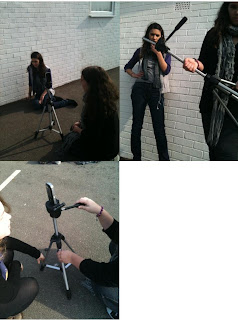
These are some photos from filming the opening scenes of our teaser trailer.

Backstory of the Ghost (Research & Planning)

The three school friends will be running from a ghost girl who is stuck in the grounds of fictional Alcott Manor. The girl was called Elizabeth Wilman and was the daughter of the woman who owned the house. She was killed in the bath tub, which is now left outside for the public to view. She is a vengeful spirit who will possess one of the three friends.

Photos from Polesden Lacey Filming

Friday, 2 March 2012

Filming at Polesden Lacey

On Friday 2nd February, we filmed out main scenes at the National Trust property Polesden Lacey. We chose this location because of it's vast amount of contrasting areas which could add variety to our teaser trailer. Our filming went well and we were able to film a variety of scenes and work with different locations and camera shots. Most of our scenes were filmed in the garden but we also managed to get the exterior shots of the house and surroundings that we also wanted. Because the gardens are open to the public, we often had to wait until people had passed to avoid them being in the shots, but other than this, the filming was failry easy.

Tuesday, 31 January 2012

Teaser Posters Analysis (Research & Planning)

A teaser poster is usually released in advance or many months before the release of the film or maybe even the trailer. They are usually used to create awareness and hype for the film before its theatrical release. The poster has a basic image and sometimes a tagline without revealing too much information, as this is usually done by a theatrical poster later. The two differ because a theatrical trailer is released nearer the date of the move hitting cinemas and has more details, such as actors, directors and producers etc. These posters also show the rating of the film, however, because teaser posters are released before the film is finished, it usually reads 'this film is yet to be rated' or something similar, as is evident with the Zombieland (2009) teaser poster.

 
Horror film teaser posters are very simple and often lack much detail. If it is a franchise or a remake, of which people may have seen the original, then a symbolic image is used. An example of this is Friday the 13th, where the background is black and there is a white mask, which needs little explaining as it is a popular film, therefore a remake would be intriguing. There is simple writing which reads 'February Friday 13th' and considering Friday 13th is considered unlucky, it signals that it is a horror film. Another example is Buried (2010) where there is a man lying in a box at the bottom of the black poster, representing being buried, the films title. There is little release date information except 'coming soon' which encourages the audience to be aware of the upcoming film. A website is also shown, with allows the curious cinema-goers a chance to find out more. It is similar with the Devil teaser poster, it has a black background with one image, the up and down lift buttons,  and the word Devil, the films title. The image and words are a bit of an odd match, creating interest in the film and wondering what the link between devil and the lift buttons is. This poster also includes a tag line and the director, which generates a hype for the film because he is well known. Like with Buried, it says coming soon.


Cloverfield (2008) is basic yet very intriguing. The only thing written on the poster is it's release date 18/01/08; on reflection, these numbers are written in the style of a handheld camera digit displays. An iconic image, the Statue of Liberty, is shown overshadowing New York, which looks to be underattack. However, there is no indication at what is attacking nor is there a film title. This could generate hype but at the same time there is no film title, which could work if there is continuous promotion. The idea of one iconic image which looks out of place is a way to suggest what the film is going to be about.   

Friday, 20 January 2012

Provisional Filming Dates (Research & Planning)

School Scene - Thursday 19th
This date is convenient because we all have a free period.

Graveyard Scenes - Friday 27th
Polsden Lacey Scenes - Saturday 28th
All the main characters can film on these dates.

Monday, 16 January 2012

Actor 5 - Charlotte Sayers (Research & Planning)

Name: Charlotte Sayers
Age: 18
She will be playing the unnamed 'Gostgirl' who haunts and attempts to kill the three friends who are staying at Alcott Manor. A female antagonist will add a twist to the stereotypical haunters, as seen in Nightmare on Elm Street and the Texas Chainsaw Massacre.

Actor 4 - Krystal Sayers (Research & Planning)

Name: Krystal Sayers
Age: 18
She will be playing Bonnie Sayers, one of the four school friends who venture to Alcott Manor. This character could be considered the average female, one who is not necessarily strong but who reacts the way many girls would, such as being scared. Having this character will make the film more popular because the female audience will be able to relate to the film themselves.

Actor 3 - Ana De Jesus (Research & Planning)

Name: Ana De Jesus
Age: 18
She will be playing Ana Butler, the school student who dares her friends to stay at the supposedly haunted Alcott Manor. In the trailer, she will be telling both the characters and the audience about Alcott Manor, but in the film would have a much smaller role, featuring only at the beginning and the end. At the beginning she would think that she was innocently daring her friends but at the end could have a guilty conscience.

Actor 2 - Hannah Ford (Research & Planning)

Name: Hannah Ford
Age: 17
She will be playing Caroline Ford, one of the four school friends who venture to Alcott Manor. which they believe is haunted, and stay the night. The character will be the stereotypical 'dumb blonde' female, which follows the generic conventions, such as Scream, where Casey Becker is killed first. This will appeal to an audience because they can identify this film as a horror because of the characters represented.

Actor 1 - Hannah Evans (Research & Planning)

Name: Hannah Evans
Age: 17
She will be playing the character of the cocky Elena Evans. To the friends, the fact she is out-spoken is humorous but to the audience it could be considered rude.

Character Costume

Hannah E, Hannah F, Ana, Krystal - We chose these costumes as they are most suitable to our film. We have chosen simple clothes, each costume represents their character and what we believe an average group of teenage friends will wear. We have also aimed that our costumes are pratical.

Charlotte -

Character 5 - Krystal Sayers (Bonnie)

Name: Bonnie Sayers
Age: 18
Personality: The third friend is one who is considered quite confident in everyday life but when faced with a situation like this, suddenly isn't so brave. This character often beings to panic, which makes her an easy target. This could mean being either one of the first to die, or possibly a hostage of the antagonist. In our film, she will be possessed by the ghost.
This character is representative of many girls who may have confidence when in an everyday situation but would lose all that and become scared in this type of situation.

Thursday, 12 January 2012

Character 4 - Ana De-Jesus (Vicki)

Name: Vicki Butler
Age: 18
Personality: Although this character does not stay at Alcott Manor herself, she is important in starting the story as she sends the friends and future victims to the location. She is known as the (.......) and is very good at telling stories and is persuasive, leading the characters to agree unknowingly; Vladimir Propp would call this character the 'dispatcher'.