Tuesday, 20 March 2012
Monday, 19 March 2012
Poster Analysis - The Cabin in The Woods ( Research and Planning)

The genre for this poster is horror. You can tell this by looking at the colours, images and text that they have used. A lot of horror film posters have one main image on them that they want you to focus on. These images are usually 'scary' and are the main focus point of the film. This film is titled, The Cabin in The Woods and has an image of a cabin in the foreground and a faded image of a woods in the background. This doesn't give the storyline away. It's straight to the point. They want you to focus on the cabin and this poster makes that happen.
This poster has a limited amount of colour. The colours being brown, grey, black and white. This is another horror poster convention. Using these dark and plain colours adds fear to the poster. As if colours were used, it would give it a happier feel. Whereas dark colours makes you feel sad. These colours give it an empty feel.
Horror posters commonly have one image on with the title and a tag line. This keeps it simple and makes you focus on one thing. It makes you guess whats going to happen in the movie. The tagline says 'You think you know the story'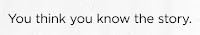
This is an eye catching tagline because you're questioning the story. This draws you in to want to see the movie as you want to know what is meant by it. It's short, simple and straight to the point. From looking at this poster i feel that when it comes to designing our groups poster, we are going to use just one image that will be the focus point of our film. I feel that we should include a tagline as it brings more attention to what the film will be about and draws you in, and is a typical convetion used on horror posters. The reason this poster is so effective is because it has stuck to the typical conventions of a horror film poster.
Thursday, 15 March 2012
Evaluation Activity 3
What have you learned from your audience feedback?
We showed our trailer to our media class who then gave us feedback, both positive and constructive criticism. We recieved a variety of comments which helped us change the trailer and what worked.
A strength of the trailer is the music, which was called very stereotypical because of it's creeypy sound. The simple, repetative piano sound gives a chilling feel to back up the montage, whilst not distracting from the images on screen. The high pitch of the music is repetitive of a horror film because it is often very unsettling. The repetetive also adds suspense to the audience because they feel something scary could happen any moment, but it doesnt, which challeges the audiences expectations.
Another strength noted was the location. We chose to film at the grounds of Polesden Lacey because there were a lot of different areas within the grounds which added diversity to the film. The over-the-shoulder shot of the ghost uses these locations to her advantage as this gives her the upperhand compared to the friends.
The shot of the bathtub with the hands coming out was also seen as a very effective shot which was reminiscent of a horror film. The group felt this gave the audience the creeps because they didn't see the whole person, which makes people ask questions which, in terms of marketing, people will see the film to get answers.
However, constructive criticism focused on the length of the trailer. When we first uploaded it to show to the class, it was about 2 and a half minutes yet we were aiming to produce a teaser trailer, which we analysed and found that the length of a teaser trailer ranged from 1.30 minutes to 1.40 minutes. Following the feedback, we cut out some repetitive shots and refined some footage so it began and stopped quicker and didn't waste time. The feedback allowed us to change this to make more identifiable as a teaser trailer.
Another was to add in more variety of camera angles, such as high and low. However, we were unable to find anytime to refilm and add some more shots in. If we were to redo this advanced portfolio, adding a more diverse range of shots would be sometime we would improve on.
Evaluation Activity 4
How did you use new media technologies in the contrustion and research, planning and evaluation stages?
On the computer we used a variety of programmes to help complete our advanced portfolio. These programmes were used in research and planning, filming and editing as well as the evaluation.
To film our teaser trailer, we used a digital HD DVI video camera made by GE. This camera allowed us to pick up a lot of detail in our shot and give us a very clear image, which made our final piece look very professional. Comparing this with our Year 12 foundation portfolio, it looks much better because the picture quality allows for more clarity and when we added effects in and changed the contrast of the picture, it was still clear and not pixelated.
To give the shots more professionalism, we used a tripod to steady the shots. We used this for each shot as it kept it steady because we are not using the hand-held camera effect. It allowed the pan to be steady and flow more so it wasn't jumpy and with the tilt and high angle shot it didn't shake, which will not put the audience off of what is actually in the frame. Using the tripod was a progression from last year because, although we were trying for the hand-held effect for the audience to feel they were in the stalkers position, there were some shots which looked very amateur without a tripod; so this year watching it felt like much improvement had been made.
 |
| The high definition camera allowed our shots to be much clearer. |
 |
| Using the tripod allowed our shots to look more professional and allowed us to experiment with different camera shots and angles. |
There were a vast amount of other media technologies which we used in our research and planning stages and creation of our film poster and magazine front cover. To edit our film we used Adobe Premiere Elements (4). We learnt more about the porgramme this year because we experimented more with effects and transitions. For example, last year we simpl inserted a black screen, which, although effective, looked a bit jumpy. So this year we used a fade-to-black effect which broke the trailer up and kept suspence for the viewer becuase they didnt know what was happening next.
We had to learn to use Adobe Illustrator (3) and Adobe Photoshop (2) from scratch. By doing this, we were able to develop our skills in making the image look professional because we experimented with layers and colours. We used internet search engine Google (9) to search for images to edit into photoshop. For instance, we searched for the logo of popular Empire magazine and then cleared the background to place onto our own cover. The Empire magazine website (7) also helped us create our magazine front cover. This website helped us by allowing us to go through the arcive of previous front covers, which helped us create as close to a real magazine front cover as possible by taking not of what covers included, such as bar codes, prices, issue numbers and types of images etc.
In the first research and planning stage, we had to gather statistics which would help us decide on the genre. Film institiutions are concerned with revenue and so are interested in the audience they could be targeting the film at. For a horror, we found that males, aged between 16 and 24 which made us look into the conventions of the horrors. We used YouTube (1) to look into horror teaser trailers and analysed them to see what was repeated within the genre.
Throughout, we have used Blogger (5), an online blogging site, as a diary to note down all our research, plans and to keep track of our progress with filming and editing etc. By doing this, we stayed on top of our projects by keeping up to date and alos keep a checklist of what we needed to do. To help Blogger look neat and organised, we used Paint (8) to organise photos and images in order to make the images easily viewed.
Throughout, we have used Blogger (5), an online blogging site, as a diary to note down all our research, plans and to keep track of our progress with filming and editing etc. By doing this, we stayed on top of our projects by keeping up to date and alos keep a checklist of what we needed to do. To help Blogger look neat and organised, we used Paint (8) to organise photos and images in order to make the images easily viewed.
 |
| The vast aray of media technologies we used in the various stages whilst creating our Advanced Portfolio. |
 |
| During the creation of our magazine front cover and the edting of our footage for our teaser trailer, we learnt a lot more about the program and our abilities became much stronger. |
Evaluation Activity 2
How effective is the combination of your main prduct and ancillary texts?

'The three ancillary texts we produced for our advanced portfolio for our A2 media studies course was a teaser trailer, a magazine front cover and a film poster. These three media help to advertise and market a film which is due to be released.
The teaser trailer is one of the first things to be released, so is therefore relativley short and vaugue. It does, however, leave questions that the audience will want answered. For example, with the hands coming out and retracting in the bath leaves the audeince wondering who she is. This links nicely to the magazine front cover, on which the ghost is the main image, so the audience may believe the article will contain some sort of spoiler or clues as to who she is. The viewers will also be able to relate the two because the film's title 'Lost Soul' is on the cover as well as in the trailer.
In each of the media texts, we focused on a different part of the film. The trailer focused on the grounds of Alcott Manor as this is where the horror of the film happens and is the most visual, giving the audience the chance to put themselves in the position of the group of friends. The poster focuses on the fictional Alcott Manor. By doing this, it is a generic convention of horror films because of the haunted house. The simple picture with the darkened background doesn't give many details away, which will keep the audience guessing. The tagline also makes the audience interested because it directly addresses them by saying 'Watch Your Back'. The Empire magazine cover focuses on the antagonist in the film. The dark colour scheme helps convey the disturbing horror genre. Together, each of these convey the generic conventions of a horror film.
An improvement on all three could be having an image which is repeated on each media text, which would help the audience associate all three. Such as the bloody hand print on the poster, if we had put this in the trailer and on the magazine front cover in one way or another, it would have been a continuing theme to directly link the three together.'

Evaluation Activity 1
In what ways does your media product use, develop or challenge forms and conventions of real media products? (i.e. of teaser trailers/poster/magazines)
 The third screen shot is an inter title which is shown around 55 seconds into the trailer. By this time, the story and characters have been vaguely told or seen. The use of the inter title, is to fill in the blanks for the audience as well as introduce an element of uncertainty for the characters. For the audience, they feel the need for the characters to feel safe and survive, or at least see one escape (Maslow's Hierarchy of Needs theory), although the nature of the film may forbid this, challenging the audiences expectations. This shot is edited in using the fade-in effect on Adobe, this added suspense to the audience as it took time to appear on screen so the audience were not sure as to what was coming. This style of tag line 'No Soul Is Safe' almost implies a difference to horror films because it is showing that no character will have preference to another and that everyone is a target. This is different to the first three Scream films, when virgins were safe and wouldn't be killed by ghostface.
The fourth screen shot shows one character being grabbed the ghost. This shot is a mid to close shot which allows the characters emotion to be seen but it also adds mystery to why was she taken and not the others. The genre is suggested in this shot by the typical lone girl who is then targeted because of her vulnerability. The setting also helps suggest this as, through the montage, the location has been shown as a continuing, vast area of land which the girls are unfamiliar with; which further adds to them being easy targets. The target audience for a horror film is 16-24 males; a young girl getting captured could help prove Laura Malvey's Male Gaze theory. This shot continues on from a sequence of the same girl running from something with the audience hoping that once she hides she'll be safe - but then she is caught; which adds to tension and unsuspecting narrative of the trailer.
The next shot shows two of the characters running from something or someone. Although the characters have not been fully introduced, you can tell they are scared. The audience will empathise with them as they will most likely feel the same if they were placed in a similar situation. Viewers could watch this film as a form of escapism and therefore need to be reassured that one of the characters will survive. This will help the film generate revenue because the audience will want to see which characters survive - if any do. Narrative is clearly shown through this shot, as the characters are running from something and they are clearly just trying to survive. The body language of the characters highlights this, as they are continually looking over their shoulder and seeing if they are being pursued.
The introduction of the ghost is placed in the middle of the montage, and a quick flash makes it hard to determine although the audience, having seen the characters several times, will know that she is not one of them. The high angle shot highlights the fact that she is in control and that the friends are obviously not. The setting is also a new one, which demonstrates that the ghost knows her way around the grounds, once again handicapping the group of friends as they could end up lost, another threat to their safety. We used a special effect on Adobe, which darkens the image and grained it in black and white. This also helps show that the ghost is not of their age and the difference in shot could mean that she is not to be trusted.
The seventh screen shot is a high angle, over the shoulder shot of the ghost looking down on one of the friends, a possible target. This frame has several effects and conveys the genre of the film well. The high angle gives the ghost the power of the shot, reiterating older shots with the variety of surroundings, suggesting that the friends are the targets and weaker; with the ghost being more dominant. The over the shoulder shot almost gives the audience the chance to see from the ghost's perspective, which makes the audience uneasy because they want to see the story from the girl's side. This shot in the montage is quite long as the friend walks a while before noticing the ghost, which implies that they are less in control, which stops the audience feeling the need for the character to survive (Maslow's Hierarchy of Needs). The genre of horror is easily identifiable in this shot because you do not fully see the ghost, which makes the audience nerved and unsure about who or what the friends are being a threatened by.
The final two frames are from before the inter title of the film's name 'Lost Soul' and 'Coming Soon'. These two shots challenge each other and are very typical style of shots in a horror trailer. The first frame shows the arms of a someone slowly emerging from a bath outside, adhering to the earlier story told by the character of a woman dying in a bath tub which is now left outside. The slow movement is creepy and adds suspense to the audience. To them, this shot signals that the ghost is obviously free and haunting the friends. The second shot, when the hands retract back into the bath. This challenges the first shot because the audience think that the ghost is out, but in fact she has gone back into hiding, which once again throws the audience back into the unknown. Both shots are edited close together so that the audience do not forget the first. Those who are big fans of supernatural horror films could associate the bath as a way to kill the ghost due to the emphasis on the character emerging and disappearing the same way. The prop of the bath was actually on location and we used this to base our story around, as like most haunting in horror films, the ghost or spirit must start from somewhere or something, this narrative would be explored further in the actual film, but because it is a trailer the main plot is vague. These shots are repetitive of the horror genre because of the slow and suspenseful revealing of the hands and then they suddenly disappear, which echos Cabin in the Woods (2012).
 |
| Tilt Shot of the fictional Alcott Manor |
 |
| The introduction of the haunted house in the Woman in Black trailer. |
This is one of the early shots in our teaser trailer.
It is introduced by a low to high angle shot. This is typical of a horror trailer because it sets the scene for the audience. The audience will be able to recognise this is a horror film because of its location, a grand, and seemingly unoccupied house, which is constantly repeated convention in horror films. By using this location, it encourages audiences to watch the trailer because it is repeating enough of the genre for the audience to be familiar with, but the story could offer some difference for viewers. The low to high angle tilt gives the fictional 'Alcott Manor' an empowering feel because the audience is forced to look up at it. This helps set the genre of the film because the style of the house is often this way in stereotypical horrors, for example, the size of the house, the turrets and grand entrance. This is a similar style to the Woman in Black (2012) because of how it introduces the house with a panning shot, but we decided to use a tilt. It is edited to be playing whilst there is a voiceover from a character. This is adhering to horror genre as this is evident in many trailers. It allows the audience to put two and two together; hear the story whilst seeing where it will take place. Other trailers which use a voiceover is Babycall (2012) and Cabin in the Woods (2012) and once again Woman In Black (2012).
It is introduced by a low to high angle shot. This is typical of a horror trailer because it sets the scene for the audience. The audience will be able to recognise this is a horror film because of its location, a grand, and seemingly unoccupied house, which is constantly repeated convention in horror films. By using this location, it encourages audiences to watch the trailer because it is repeating enough of the genre for the audience to be familiar with, but the story could offer some difference for viewers. The low to high angle tilt gives the fictional 'Alcott Manor' an empowering feel because the audience is forced to look up at it. This helps set the genre of the film because the style of the house is often this way in stereotypical horrors, for example, the size of the house, the turrets and grand entrance. This is a similar style to the Woman in Black (2012) because of how it introduces the house with a panning shot, but we decided to use a tilt. It is edited to be playing whilst there is a voiceover from a character. This is adhering to horror genre as this is evident in many trailers. It allows the audience to put two and two together; hear the story whilst seeing where it will take place. Other trailers which use a voiceover is Babycall (2012) and Cabin in the Woods (2012) and once again Woman In Black (2012).
 |
| This shot shows the characters discovering the grave of 'Elizabeth Wilman'; could this be the ghost? |
The second screen shot is the introduction of the main antagonist character in the film, although not in full. The camera shot is a simple mid shot, this is because it can show enough to focus on without there being too much to take in and distorting the audience's concentration. For example, the simple location of the sparse woods means that audiences are focused on the characters and the suspicious looking gravestone. This shot in the trailer sets the story up when the characters are intrigued by who the grave stone belongs to. Digetic dialogue says it is the grave of 'Elizabeth Wilman', and following the voiceover from the early shots, audiences can link the two and begin to wonder if the dead girl in the bathtub is Elizabeth Wilman. The narrative can be associated with in this shot, because of repetitive horror films, the audience know that the group of friends will have to try to escape the grounds and kill the ghost. This shot is edited in after one of the friends dares the others to stay at 'Alcott Manor', which allows the audience to see that the friends have accepted the challenge without wasting time in the trailer showing them say yes.


 |
| One character is taken by surprise; challenging the audience's need to survive (Maslow's Hierarchy of Needs) |
 |
| Two protagonists run away from an unseen threat - What is it? Where will they go? This keeps the audience interested and want to watch the film to find out. |
 |
| The first full body introduction of the ghost. |
 |
| The over the shoulder shot gives the ghost the dominance in the frame. |
 |
| The same two shots but with a difference; the hands can be seen but then disappear, this is repetitive of a horror film because it is creepy and suspenseful |
Wednesday, 14 March 2012
Music
For our teaser trailer for our horror film we need to find suitable non-copyright music. We have a few specific ideas already and are using internet sites such as Incomptech to find the right music. We are hoping to have some quiet and slow harmony music at the beginning of the trailer, playing in the background, as the characters and story are vagueley introduced. During the montage section of our trailer, we want a piece of fast music with a beat to add it. As well as adding tension, this is a common part of teaser trailers for this genre because horror films are not focusing on characters or story and do not market around this.
Subscribe to:
Posts (Atom)